

Short Takes investment blog, Ciovacco Capital Management, LLC
SHORT TAKES
A common stock market narrative in 2018 goes something like this:
The consistent gains and low market volatility are the hallmark of a blow-off top in stocks.
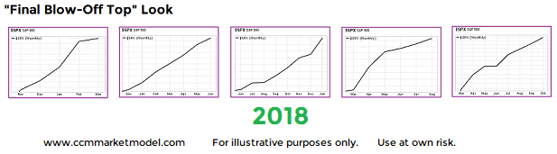
Is it possible that a consistent, low-volatility market is a common characteristic of early-stage secular bullish moves? The S&P 500 monthly charts below come from nine different periods.
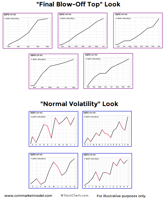
How did stocks perform after the looks above? Were the low-volatility periods followed by horrible bear market losses? The answer is no.
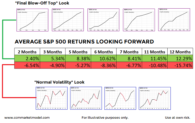
In fact, 2018 was included in the charts above, and it clearly looks more like the favorable periods relative to the unfavorable, higher-volatility periods.
The charts and concepts are described in detail in the video below.
Last year Wall Street was overly conservative with what The Wall Street Journal referred to as their "pathetically wrong" 2017 stock market forecasts. This year the conversation has come full circle, with countless calls for a late-stage bull market 'melt-up'.

Since a 'melt-up' implies a certain degree of irrational behavior that could be followed by a harsh bear-market lesson, it is prudent to see what present-day and historical facts have to say about the seemingly logical melt-up theory. This week's video presents charts in an objective and unbiased manner, allowing you to draw your own melt-up conclusions.
Recent posts on Shiller's CAPE ratio and standard PE ratios provide some additional insight into the melt-up equation.
Were Charts Helpful In 2017 And How Can They Help In 2018? Click here.
