Key Points: Bull Markets And Bottoms

The market opened down Tuesday.  Since humans tend to focus on what is in front of them (a red screen), it is prudent to review some "stay focused on the facts" key points.

KEY #1: IT STILL LOOKS LIKE A BULL

2000-stock-market-peak-2-13.png
2007-stock-market-peak-2-13.png

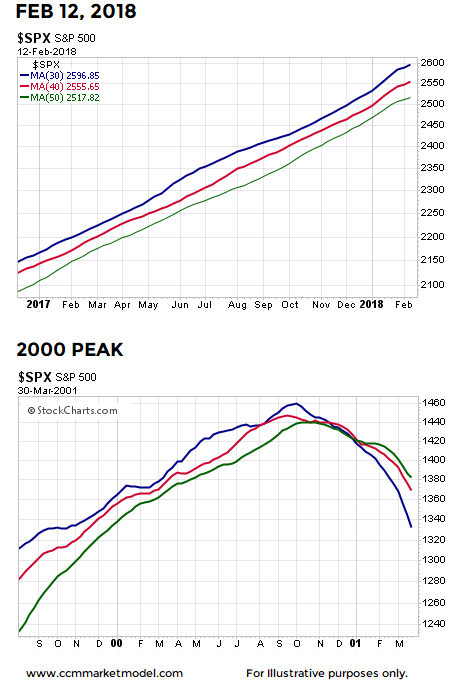
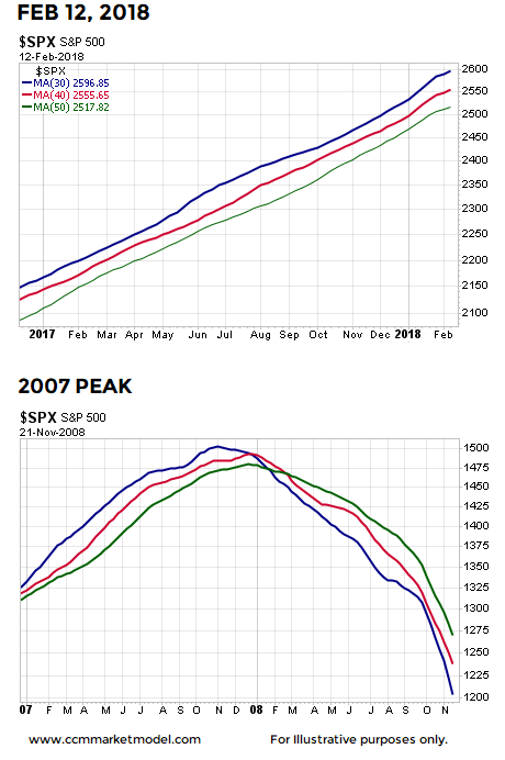
The video at the bottom of this post compares 2018 to 2000 and 2007 using numerous timeframes; the conclusions are the same.

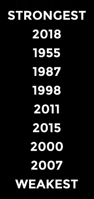
KEY #2: 2018 HAS THE STRONGEST RELATIVE PROFILE

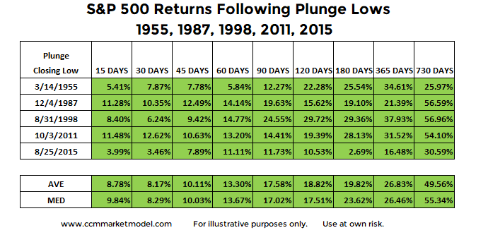
As outlined in detail in Stock Market Plunge Period Reference Points, 2018 has the strongest fact/data-based profile relative to the volatile periods shown below.  When plunges occur from strong market profiles, the waterfall drop tends to be sharp, but relatively brief in duration. 

stock-market-corrections-and-bear-markets-2-13-s.png

KEY #3: BULL MARKETS MAKE HIGHER HIGHS

We are currently in a bull market. Bull markets by definition make a series of higher highs and higher lows. Thus, if we believe the bull market is still intact, at some point in the future, stocks  will make a new all-time high.  Bull markets reward those with patience and a long-term focus.   

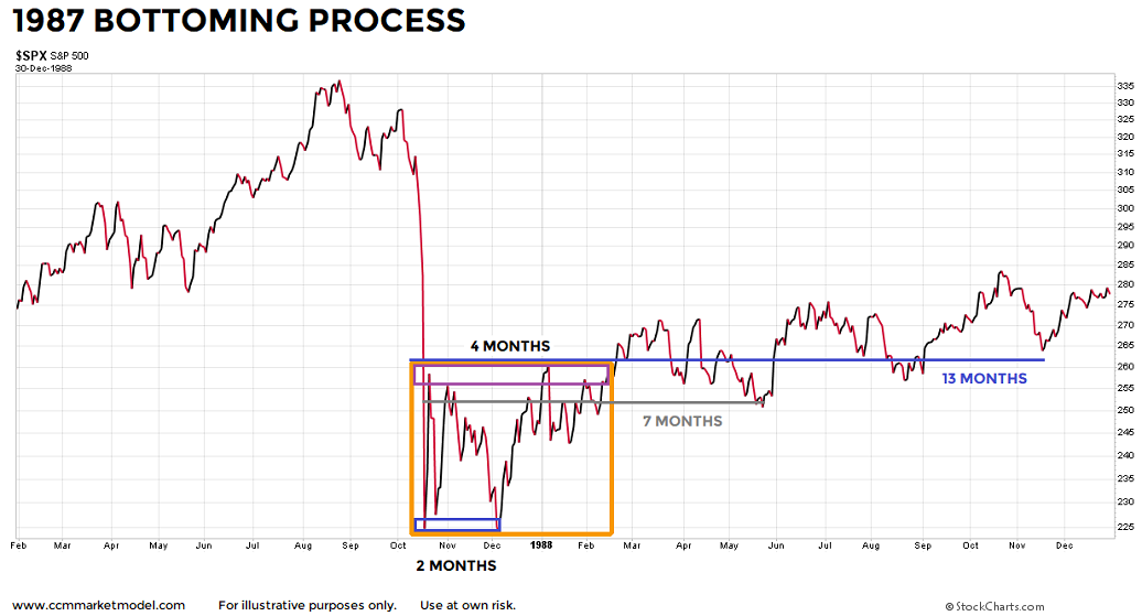
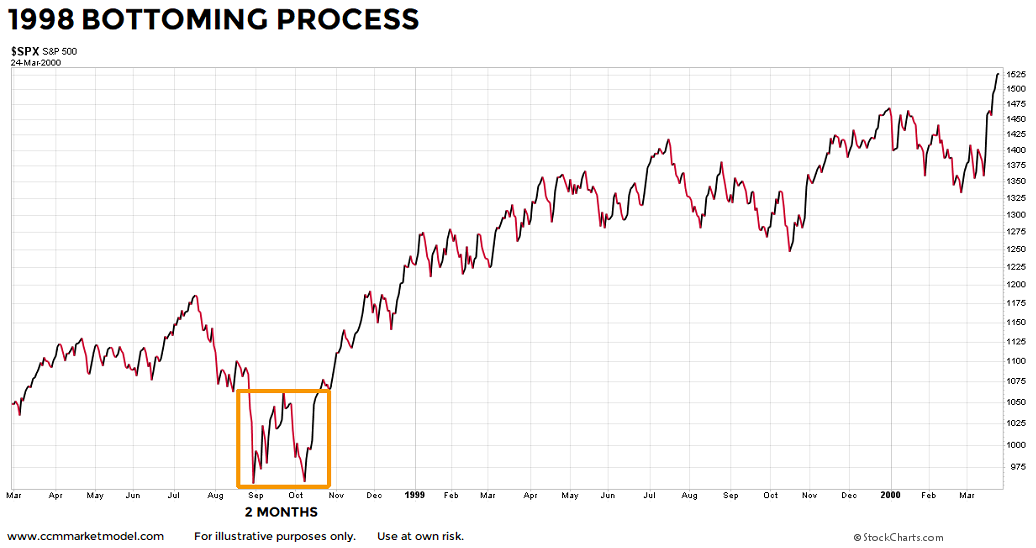
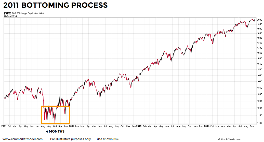
KEY #4: BOTTOMS CAN TAKE TIME TO FORM

As shown in the charts below, even after the plunge period was complete, it was not a volatility cake walk in the three historical cases.  In 1987, the S&P 500 printed a slightly lower low two months after the waterfall plunge. 

stock-market-bottoms-1987-f.png

In 1998, the original plunge low was retested a few weeks later and price stayed inside a yo-yo box for two months.  Nothing says the market has to give an "all clear" signal after a plunge. 

stock-market-bottoms-1998.png

In 2011, stocks were in a bull market, a waterfall decline occurred, and stocks subsequently stayed inside a wild-ride volatility box for 4 months.  As expected in a bull market, stocks eventually  followed the plunge with very satisfying gains.

stock-market-bottoms-2011.png

IN EACH CASE, A HIGHER HIGH WAS MADE

2018 really doesn't look anything like 2000 or 2007.  2018 is stronger than 1955, 1987, 1998, 2011, and 2015 (bull market cases).  In every bull market case, stocks eventually followed the bull market script and printed a higher high.  A higher high means higher profits and higher account balances relative to pre-plunge profits and balances.   

stock-market-returns-after-waterfall-declines-corrections-b.png

REALISTIC EXPECTATIONS ARE PART OF ANY SUCCESSFUL ENDEAVOR

It would be great if the stock market was green every day and we never had a correction in a bull market.  Common sense tells us that is not realistic.  Even if we remain in a bull market and stocks eventually go on to make a new all-time high later this year (TBD), we should not expect every day, every week, or every month to be green. 

The market's present day long-term profile allows us to be patient. If the profile deteriorates in a material manner, then we will take the necessary defensive steps.  We will continue to take it day by day, remaining open to all outcomes. 

ADDITIONAL FACT-BASED ANALYSIS

Will Rising Yields Push The Bull Over An Important Demarcation Line?

MARKETS CAN GET SPOOKED BY RISING YIELDS

This week's video covers numerous topics and markets, including the selloff in bonds, the impact on stocks, comparisons to 2000 and 2007 major tops, status of multiple-year breakouts, asset class behavior near tops and bottoms, tech stocks, industrial stocks, S&P 500,  Value Line Geometric Index, and the broad NYSE Composite Stock Index.  The video covers over 40 charts.

Markets And Investing: Keys To Success

THURSDAY UPDATE:   Please see CCM Twitter feed for latest comments. 

The concepts below are vitally important in order for us to successfully navigate the volatile and emotionally-draining financial markets.

It Is Often Darkest Before The Dawn

Facts Instead Of Fear

In a separate post, we compared 2018 to numerous plunge periods in history (1955, 1987, 1998, 2000, 2007, 2011, and 2015). 

Having studied markets for years, we can confidently say the data we have in hand in 2018, on multiple timeframes, looks almost nothing like the data we had in hand before plunges in 2000 and 2007.  The most similar periods are 1955, 1987, 1998, 2011, and 2015. 

Therefore, it might be helpful to better understand what happened after the plunge was over in the five similar cases.  Did stocks tank or did they find their footing and produce positive returns.  The data speaks for itself.

stock-waterfall-low-subsequent-returns-sp500-spx22.png

Probabilities, Not Predictions

Is it possible stocks continue to tank over the next two years?  Yes, anything is possible, but it is not probable based on the historical data and 2018 data.  We will continue to take it day by day, with an open mind about any and all outcomes, from wildly bearish to outrageously bullish.  If the hard data says we need to take defensive action, we will not hesitate. If the hard data says we should be patient and sit tight, we will choose the "do nothing" alternative. 

Charts For All Cases, Including 2000 And 2007

The charts can be found here.  Anything can happen in the markets, including very low probability outcomes, but it still makes sense to understand the probability of good things happening relative to the probability of bad things happening.   It is best to maintain a flexible, unbiased, and open mind, which allows us to prudently interpret new facts over time.