History Says Rising Rates Are Bullish For Stocks

OTHER VOICES

In recent posts on rising bond yields and a bull/bear eye test, we noted rising bond yields are typically associated with bull markets and an improving economic outlook.  From time to time, it is helpful to hear the message from other sources. From MarketWatch:

How big of a headwind do high rates really represent? According to equity analysts, not big at all. In fact, they may even be a positive. Despite the recent turbulence, historically, “equities have gained significantly in periods of rising rates,” wrote Jodie Gunzberg, managing director and head of U.S. equities at S&P Dow Jones Indices, in an email. “Since 1971, the S&P 500 has gained about 20% on average in rising rate periods, has gained 8 of 9 times and has gained nearly 40% twice, with less than a 4% loss for its worst rising rate period.” Gunzberg’s analysis evaluated the benchmark U.S. index on a total-return basis.

From CNBC

"I want everybody to sit back, relax and let's look at this history," Acampora told CNBC's "Futures Now" on Tuesday.  He picked out a chart that he says proves the case.

cnbc-chart-rates-and-stocks.png

"Stare at the lower left-hand corner of that chart carefully," said Acampora. "Look at the years between 1948 and 1962. Guess what — rates started turning up. Look at the chart up above it, the stock market went up. In other words, you can have rising stock prices with rising interest rates."

"There'll be a lot of volatility," added Acampora. "But, the secular bull market is alive and well. I think you've got years left even with rising rates."

S&P 500: NORMAL PULLBACK

Fibonacci retracements help us understand what a normal pullback typically looks like within the context of an established uptrend.  Even if we examine a relatively short timeframe dating back to August 2017, the S&P 500 remains near the typical retracements of 38.2%, 50.0%, and 61.8% of the prior A to B move.   If the trend remains in place, we would expect the S&P 500 to eventually make a higher high above the previous high, which is what bullish trends do by definition. 

ccm-short-takes-spy-fibs-2-20.png

If the levels above fail to hold in the coming days and and weeks, the bears will have taken a small baby step in relation to the bigger picture evidence outlined in the video below.

WHY EVERYTHING YOU KNOW ABOUT STOCKS AND BONDS IS ABOUT TO CHANGE

This week's video asks what can we learn about the stock market's long-term risk-reward profile by studying three charts:  (1) S&P 500 vs. 30-YR Treasuries, (2) Value Line Geometric Index, and (3) the NASDAQ.

Why Everything You Know About Stocks And Bonds Is About To Change

STOCKS VS. BONDS – THE SINGLE BEST SIGNAL

This week's video asks what can we learn about the stock market's long-term risk-reward profile by studying three charts:  (1) S&P 500 vs. 30-YR Treasuries, (2) Value Line Geometric Index, and (3) the NASDAQ.

INVESTING FOR INCOME IS A WHOLE NEW BALLGAME

All instruments that pay dividends have bond-like characteristics, including preferred stocks, MLPs, and REITS.  Therefore, the concepts in this week's video impact all yield-oriented or income-oriented investments. 

short-takes-income-investing-has-changed.png

Why Tech Stocks Could Rise For Many Years

STATUS OF THE NASDAQ'S LONG-TERM BREAKOUT

Between points A and B in the chart below, the tech-heavy NASDAQ experienced numerous bouts of emotionally-draining volatility.  The same A to B period featured a secular trend that lasted 16.66 years and posted a hard-to-comprehend 1,513% gain.

nasdaq-breakout-long-term-2-14-2018f.png

Since the latter stages of the 16.66 year move checked every "this looks like a bubble" box, it is not surprising the market had to consolidate its gains, which is exactly what happened over the next 16.66 years.  Between points B and C, the NASDAQ went absolutely, positively nowhere before breaking out of the massive and multiple-year consolidation box in late 2016 (above point C).

THE LONGER A MARKET GOES SIDEWAYS

Regular viewers of CCM's weekly videos are familiar with the expression, the longer a market goes sideways, the bigger the move we can expect to get after either a bullish breakout or bearish breakdown.  Prior to completing the 1991-2000 leg of the secular move, the NASDAQ went sideways for 3.8 years. Prior to breaking out and successfully retesting the breakout in 2016, the NASDAQ went sideways for 16.66 years (see chart below).

nasdaq-breakout-long-term-2-14-2018-2.png

MORAL OF THE STORY

The moral of the story is market fractals tell us it is in the realm of possibility the NASDAQ could rally for a period much longer than the human mind can easily comprehend and the magnitude of the gains could be extremely satisfying.  If you have studied charts for years, the previous sentence is not really even debatable; it is the message from the present day charts.   

PROBABILISTIC STATEMENTS BASED ON FACTS

We are simply making statements about the probability of good things happening relative to the probability of bad things happening over the next 5 to 20 years.  If the facts in hand and charts change in a meaningful way, the assessment of the probabilities must be adjusted as well.   We will continue to take it day by day, remaining open to all outcomes, from wildly bullish to painfully bearish. 

YOU ARE OUT OF YOUR MIND

If we were working on Wall Street in 1990 and called a group of coworkers and clients into a conference room and said...

"The NASDAQ WILL gain 940% over the next nine years"

...you would have been laughed out of the room and told to get some help.  And yet, that is exactly what happened between points E and F below.  Skepticism is part of the early stages of a secular trend script.  We are supposed to be skeptical with chart patterns like the one shown below.  It is logical to be skeptical after the NASDAQ disappointed us for 16.66 years.

nasdaq-breakout-long-term-2-14-2018-1991.png

WHAT ABOUT?

The market considers all topics on all timeframes.  Therefore, every single "what about" question is reflected in the charts above.  

  • What about valuations?  Click here
  • What about the fact that stocks have gone up for 9 years? Click here
  • What about the health of the bull market in light of recent volatility? Click here

Key Points: Bull Markets And Bottoms

The market opened down Tuesday.  Since humans tend to focus on what is in front of them (a red screen), it is prudent to review some "stay focused on the facts" key points.

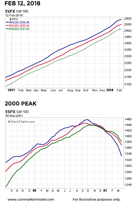
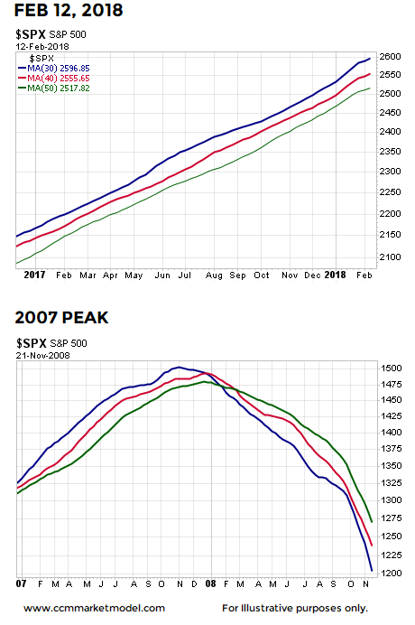
KEY #1: IT STILL LOOKS LIKE A BULL

2000-stock-market-peak-2-13.png
2007-stock-market-peak-2-13.png

The video at the bottom of this post compares 2018 to 2000 and 2007 using numerous timeframes; the conclusions are the same.

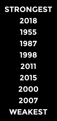
KEY #2: 2018 HAS THE STRONGEST RELATIVE PROFILE

As outlined in detail in Stock Market Plunge Period Reference Points, 2018 has the strongest fact/data-based profile relative to the volatile periods shown below.  When plunges occur from strong market profiles, the waterfall drop tends to be sharp, but relatively brief in duration. 

stock-market-corrections-and-bear-markets-2-13-s.png

KEY #3: BULL MARKETS MAKE HIGHER HIGHS

We are currently in a bull market. Bull markets by definition make a series of higher highs and higher lows. Thus, if we believe the bull market is still intact, at some point in the future, stocks  will make a new all-time high.  Bull markets reward those with patience and a long-term focus.   

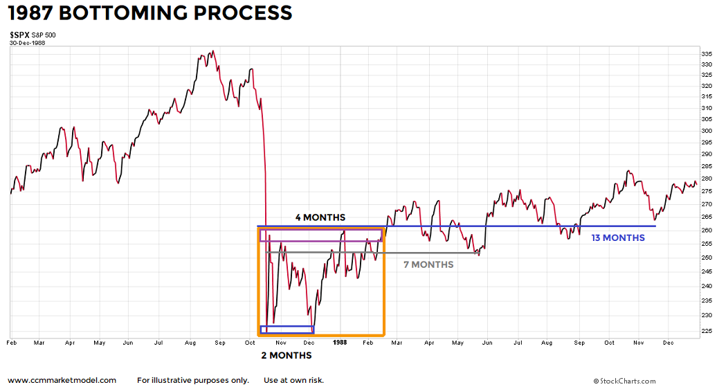
KEY #4: BOTTOMS CAN TAKE TIME TO FORM

As shown in the charts below, even after the plunge period was complete, it was not a volatility cake walk in the three historical cases.  In 1987, the S&P 500 printed a slightly lower low two months after the waterfall plunge. 

stock-market-bottoms-1987-f.png

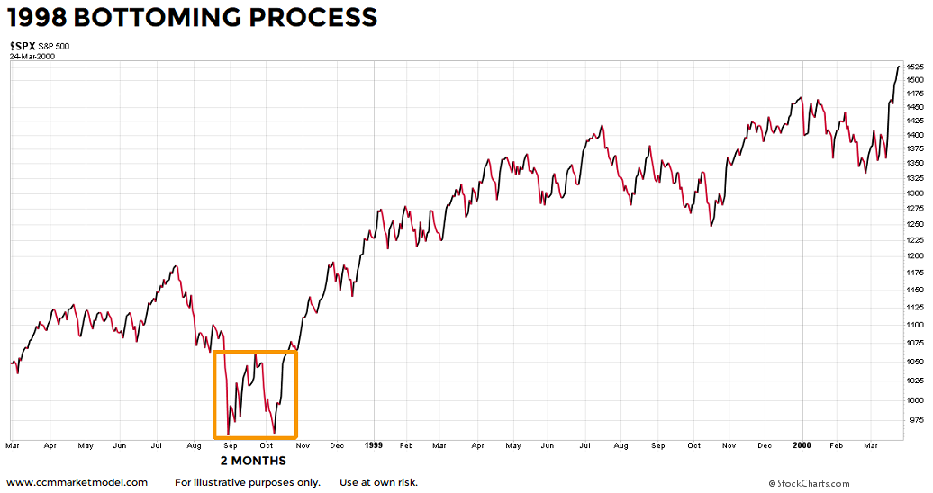
In 1998, the original plunge low was retested a few weeks later and price stayed inside a yo-yo box for two months.  Nothing says the market has to give an "all clear" signal after a plunge. 

stock-market-bottoms-1998.png

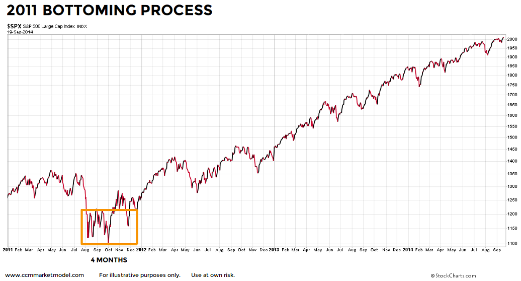
In 2011, stocks were in a bull market, a waterfall decline occurred, and stocks subsequently stayed inside a wild-ride volatility box for 4 months.  As expected in a bull market, stocks eventually  followed the plunge with very satisfying gains.

stock-market-bottoms-2011.png

IN EACH CASE, A HIGHER HIGH WAS MADE

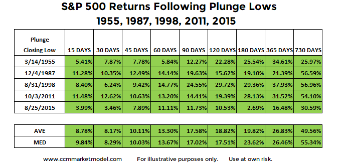
2018 really doesn't look anything like 2000 or 2007.  2018 is stronger than 1955, 1987, 1998, 2011, and 2015 (bull market cases).  In every bull market case, stocks eventually followed the bull market script and printed a higher high.  A higher high means higher profits and higher account balances relative to pre-plunge profits and balances.   

stock-market-returns-after-waterfall-declines-corrections-b.png

REALISTIC EXPECTATIONS ARE PART OF ANY SUCCESSFUL ENDEAVOR

It would be great if the stock market was green every day and we never had a correction in a bull market.  Common sense tells us that is not realistic.  Even if we remain in a bull market and stocks eventually go on to make a new all-time high later this year (TBD), we should not expect every day, every week, or every month to be green. 

The market's present day long-term profile allows us to be patient. If the profile deteriorates in a material manner, then we will take the necessary defensive steps.  We will continue to take it day by day, remaining open to all outcomes. 

ADDITIONAL FACT-BASED ANALYSIS