
The Message From Up/Down Volume
DOT-COM BUST BEAR MARKET
When the S&P 500 reached a bull/bear tipping point in March 2000, NYSE Advancing - Declining Volume was already waving yellow flags. As shown in the chart below, $NYUD was hugging its 50-week moving average and the 50-week was rolling over in a bearish manner.

FINANCIAL CRISIS BEAR MARKET
A similar and ominous rollover look occurred in $NYUD’s 50-week moving average soon after the S&P 500 peaked in October 2007. Notice how $NYUD tested the 50-week and then failed by dropping below the 50-week.

HOW DOES THE SAME CHART LOOK TODAY?
The 2017-18 version of the same breadth indicator looks nothing like the 2000 peak nor the 2007 peak. $NYUD remains well above a positive-sloping 50-week moving average and is near new highs, indicating a much healthier market versus 2000 and 2007.

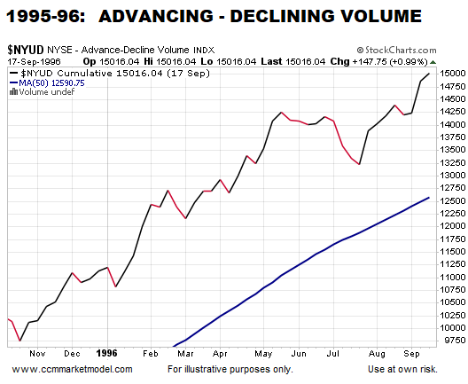
HOW DOES 2018 COMPARE TO A BULLISH PERIOD?
There is no question 2018 looks more like 1995-96 than the major stock market peaks in 2000 and 2007.
WHY IT IS IMPORTANT TO HAVE AN EXIT STRATEGY
This week’s stock market video covers the present-day market in the context of bear market migration strategies. Now is the time to water test your portfolio/asset allocation strategy.
UP/DOWN VOLUME IS ONE PIECE OF EVIDENCE
The charts above align with numerous data points that continue to favor long-term bullish outcomes for the markets and economy. If the data begins to shift in a meaningful way, we must be flexible enough to reassess the odds of good things happening relative to the odds of bad things happening.
Stocks: Time To Locate The Nearest Exit?
MIGRATION AND WATER TESTING PIE CHARTS
The Market's Tell
INVESTOR CONVICTION
When markets peak, it speaks to a changing of the guard. During the bullish phase, the conviction to own growth-oriented stocks is greater than the conviction to own defensive-oriented bonds. During the bearish phase, the conviction to own defensive-oriented bonds is greater than the conviction to own growth-oriented stocks. The stock/bond ratio (see chart below) peaked several months before the major stock market peak that occurred in October 2007. The blue 100-day moving average helps us visualize the changing of the guard.

A NEW GUARD IN TOWN?
Thus, if the January 26, 2018 peak in the stock market was part of a major-topping process, we would expect to see the conviction to own defensive-oriented ETFs increase relative to the conviction to own growth-oriented ETFs, which is not the case as of September 10. We could have made the same argument using numerous risk-on/risk-off ratios. Broad asset class behavior continues to side with the bullish case.

A STRONG VISUAL STATEMENT
If we remove volatile price from the equation and focus solely on the stock/bond trend, we see a stark contrast between investor conviction in 2007-08 and 2017-18.

SIMPLE AND POWERFUL CHARTS
This week’s stock market video uses six simple charts to illustrate important concepts about investing, risk, and asset allocation. Comments from viewers include “must watch”, “only video you need to watch ”, and “excellent video”.
CHARTS HELP US ASSESS ODDS
Present-day charts tell us to remain open to better than expected stock market outcomes. If the charts deteriorate in a meaningful way, we must be flexible enough to reassess the odds of good things happening relative to the odds of bad things happening. We will continue to take it day by day.