
JUST THE FACTS - NO OPINIONS
LONG-TERM TRENDS
The facts we have in hand on Monday, September 24, tell us the market’s long-term trend remains constructive. The charts below show the 100, 200, and 300-day moving averages in 2018 and 2008.

POSSIBLE SUPPORT BELOW
Since one of the hardest things to do is sit tight during normal volatility that regularly occurs within the context of a long-term bullish trend, it can be helpful to understand areas of possible support below the market. Price action has identified the 2848-2873 range as one area of possible support should the market decide to backtrack (see top of orange box below). If that range is violated, the top of the yellow box comes into play between 2790 and 2805.

RETRACEMENTS ARE NORMAL
Markets often have “give back” periods within the context of an existing uptrend. For example, based on the intermediate-term bullish move off the February 2018 YTD low, it would not be unusual for the S&P 500 to retrace 38.2%, 50.0%. or 61.8% of the A to B move before going on to make a higher high above point B. If price stays below the 61.8% retracement, the odds of a bearish reversal would increase. For us, the moral of the story is there are numerous reasons to be patient during 100% normal and to be expected volatility within the context of an existing and ongoing uptrend (until the hard data says otherwise).

Our purpose here is not to predict any movement in price (up or down), but rather to understand the range of possible outcomes within the context of a constructive trend.
IS INFORMATION OVERLOAD KILLING YOUR INVESTMENT RETURNS?
This week’s stock market video covers numerous “we need to be careful about this” topics that were covered in 2017, allowing us to review them in the context of what has transpired in 2018.
THE REALLY BIG PICTURE
The average stock remains above areas of previous resistance that came into play in 1998, 2007, and 2015.

HARD TO CALL THIS BEARISH
The average stock just printed a new all-time monthly closing high last month. It is difficult to wedge this factual piece of data into a bearish argument for stocks.

MAXIMUM FLEXIBILITY
If the data on multiple timeframes begins to shift in a meaningful way, we must be flexible enough to reassess the long-term probabilities. We will continue to take it day by day.
Is Information Overload Killing Your Investment Returns?
LATEST 2018 CHARTS
The Message From Up/Down Volume
DOT-COM BUST BEAR MARKET
When the S&P 500 reached a bull/bear tipping point in March 2000, NYSE Advancing - Declining Volume was already waving yellow flags. As shown in the chart below, $NYUD was hugging its 50-week moving average and the 50-week was rolling over in a bearish manner.

FINANCIAL CRISIS BEAR MARKET
A similar and ominous rollover look occurred in $NYUD’s 50-week moving average soon after the S&P 500 peaked in October 2007. Notice how $NYUD tested the 50-week and then failed by dropping below the 50-week.

HOW DOES THE SAME CHART LOOK TODAY?
The 2017-18 version of the same breadth indicator looks nothing like the 2000 peak nor the 2007 peak. $NYUD remains well above a positive-sloping 50-week moving average and is near new highs, indicating a much healthier market versus 2000 and 2007.

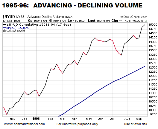
HOW DOES 2018 COMPARE TO A BULLISH PERIOD?
There is no question 2018 looks more like 1995-96 than the major stock market peaks in 2000 and 2007.
WHY IT IS IMPORTANT TO HAVE AN EXIT STRATEGY
This week’s stock market video covers the present-day market in the context of bear market migration strategies. Now is the time to water test your portfolio/asset allocation strategy.
UP/DOWN VOLUME IS ONE PIECE OF EVIDENCE
The charts above align with numerous data points that continue to favor long-term bullish outcomes for the markets and economy. If the data begins to shift in a meaningful way, we must be flexible enough to reassess the odds of good things happening relative to the odds of bad things happening.