
Fundamental Concerns: 2007/2008 vs. 2018
PREPARING FOR ANOTHER CRISIS?
As outlined in detail on November 17, when market participants see really unfavorable economic and market outcomes, they anticipate future Fed rate cuts and begin migrating to defensive long-term Treasury bonds.
Since the S&P 500 hit the first 2018 peak on January 26, market participants have had almost an entire calendar year to review present day fundamentals. Are they migrating to defensive Treasuries in a similar manner to the migration in 2007/early-2008? The answer is no. The chart below shows the long-term trend in the growth-oriented tech (RYT) vs. defensive-oriented bonds (TLT) ratio clearly rolling over in 2007 (below left); the same trend looks much stronger and sustainable today.

Are there concerns in 2018? Yes, both fundamental and technical. The charts above simply help us assess the magnitude of the concerns today relative to the magnitude of the concerns in early 2008. It has been ugly in recent weeks in 2018, but not nearly as bad as the peaking process in 2007.
MOVING TO A WEEKLY TIMEFRAME
A very similar relative picture is painted on weekly charts. The charts below tell us the fundamental concerns were much greater in 2007/early 2008 than they are today.

MONTHLY TIMEFRAME
If we compare the two periods using the slope of the 20-month moving average, the differences are once again apparent. These charts do not negate the real fundamental and technical concerns in 2018; they simply put them into some historical perspective.

WHAT ABOUT THE PLUNGE IN OIL PRICES?
The strength of the six charts above is they allow us to compare hard data to hard data; opinions, emotions, and predictions are not part of the equation. Two key factual points are noteworthy regarding oil prices.
Point One: If you are trying to gauge the health of the stock market by monitoring oil prices, it is going to be an exercise filled with frustration and bewilderment. The correlations below represent a set of measurable facts. Sometimes the price of oil zigs and stocks zig; sometimes the price of oil zigs and stocks zag. Sometimes the price of oil zags and stocks zag; sometimes the price of oil zags and stocks zig.

Point Two: The law of supply and demand tells us there are two sides to any price story. Urban Carmel’s full tweet can be found here.

TECH vs. S&P 500
There is nothing magical about the ratios or moving averages used in this post; they simply help us get a better feel for the bigger picture. In 2007/2008, tech clearly shifted from a long-term leader to a long-term laggard. The shift on the 2018 daily chart, thus far, has had little impact on the longer-term relative trend.

The weekly chart below shows the relative trend in tech was weakening noticeably before the S&P 500 peaked in October 2007. The present day chart shows much less damage.

The monthly RYT vs. SPY chart paints a much more concerning picture in early 2008 relative to late November 2018.

TECH vs. GOLD
Notice how the trend in tech relative to Armageddon-friendly gold rolled over quickly after the major S&P 500 peak in early October 2007. In 2018, we are 67 calendar days removed from the new-all time closing high in the S&P 500 that was printed on September 20, 2018. Thus far, there has been no major impact on the tech/gold ratio.

The 2008 weekly chart below shows high levels of fundamental and systemic concern. The 2018 chart looks much better.

The monthly charts look significantly different as well, favoring 2018 over 2008.

BROAD MARKET vs. BONDS
If investors felt 2018 was headed for a 2008-like crisis, it would be logical for them to seek out the safety of long-term Treasury bonds, as they did in a noticeable manner in late 2007. Thus far, present day concerns have not resulted in a similar and concerning shift.

Some vulnerability is showing up on the present day weekly VTI/TLT chart below, but nothing like the damage that was evident in the 2007/2008 case.

In each case, it is quite possible the 2018 charts morph into something as concerning as the 2007/2008 charts, but it has not happened yet.

STOCKS vs. INTERMEDIATE-TERM TREASURIES
The story is similar on the S&P 500 (SPY) vs. intermediate-term Treasuries (IEF) chart. A sharp sprint for the “risk-on” exit can be seen on the left chart below; thus far, a much tamer look on the right side.

The 2018 weekly chart shows a vulnerable trend; something that we have to respect in the weeks and months ahead. However, the relative look also tells us things look better today than they did in the early stages of the 2007-08 financial crisis.

Damage to monthly moving average in late 2007/early 2008; no damage thus far in 2018.

S&P 500 vs. TIPS
If inflation is a concern, Treasury Inflation-Protected Securities (TIPS) might attract interest relative to stocks as they did in 2007/08. Thus far, the long-term trend still favors growth-oriented stocks.

Have we had significant technical damage in 2018? Yes, and these longer-term charts do not negate those real and measurable concerns. The longer-term charts help us assess the odds of a bullish reversal in 2018 relative to morphing into a full-blown crisis. Some of the technical vulnerabilities have spilled onto the 2018 weekly chart below, but it still looks much better than after the S&P 500 peak in 2007.

The 20-month moving average rolled over sharply in late 2007/early-2008. Thus far, we are not seeing a similar reversal.

STOCKS vs. SHORT-TERM TREASURIES
Looking at short-term Treasuries does not significantly impact the comparison between post-peak-2007 and post-peak-2018.

The weekly charts once again tell us to keep an open mind about bearish outcomes in 2018. But once again, the 2018 chart looks significantly better than the 2007/2008 chart.

The monthly comparison also shows greater fundamental concerns in 2007/08 relative to what we have seen thus far in 2018.

STOCKS vs. SILVER
Stocks were in a clear downtrend relative to silver in 2007/08; even the 200-day moving average had clearly printed a lower high and lower low, something that is not close to happening in 2018.

The weekly charts look significantly different after the major stock market peak in 2007 and the peak in September 2018.

Silver held up better than stocks in late 2007/early 2008. Thus far, a similar shift in the long-term trend has not occurred.

UGLY HISTORICAL CHARTS
This week’s stock market video puts the current ugly market into some historical perspective. The opening segment of the video reviews the historical cases below allowing us to better understand the wide range of outcomes still possible in 2018.

The charts above in no way, shape, form, or fashion offset the concerning technical damage that we have in late November 2018, which is why this week’s video also covers the importance of having a risk-mitigation strategy should 2018 morph into a more prolonged and serious correction/bear market/crisis.
IS THE BULL MARKET DEAD AND BURIED?
POWERFUL HISTORICAL CASES
SETUPS... STILL NEED FOLLOW-THROUGH
NEW DEVELOPMENT IN TUESDAY’S SESSION
A November 14 Short Takes post compared the present day S&P 500 to the major low in February 2016. If you reviewed those charts in detail, you may have thought the 2018 market seems to be a few days behind the look of the 2016 chart (we thought that). Below are the same charts updated as of the close on Tuesday, November 20, 2018 (right side). You may recall our original comments about the charts:
“If we compare the strength of the move off the first low (compare A to B), you can make a case that numerous indicators looked stronger at point B then they did at point A. For example, in 2016 CCI never approached 100; in 2018 CCI recently cleared 100.”

ANOTHER INTERESTING SIMILARITY
Tuesday’s session in the S&P 500 featured a gap down. The lowest low in 2016 also featured a gap down.

ABANDONED BABY SETUP
The image/text below comes from Investopedia.

The first and incredibly important part of the definition above is the potentially bullish abandoned baby is a THREE candlestick pattern. In 2018, we have 2 of the 3 candles, which leaves this firmly in the TBD category. The image below provides another example of the setup relative to the S&P 500’s close on Tuesday.
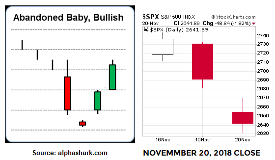
What does price action from Tuesday, November 20, 2018 tell us? The market gapped down due to high conviction to get out near the open. The doji-like candle on the daily chart (above right) tells us after the market opened, the battle between bullish conviction and bearish conviction was fairly balanced (unlike the open). The S&P 500 gapped down at the open and traded at 2462 in the first 25 minutes; it closed at the same level at 4:00 pm ET (orange horizontal line below).

HOW MUCH STOCK DO YOU PUT IN THE SETUPS ABOVE?
The simple answer is “not much at all until the market shows us something in 2018”. However, the information does provide “try to be patient” hard data relative to the possibility of a reversal in stocks. As noted numerous times, setups are useless without market confirmation. In 2018, confirmation means some hard data showing an increase in the conviction of buyers relative to the conviction of sellers (some good-looking green candlesticks). As of this writing, we do not have it; still have Wednesday and Friday to go this week.
OTHER TAKEAWAYS FROM 2016 LOW
We cannot think about binary and clean outcomes; markets are much messier in the real world. For example in 2016, if we thought (a) a lower low means a retest fails or (b) several lower closes below the prior closing low means a retest attempt is dead in the water, we would have missed the move that followed.

Those who remained flexible and kept an open mind in 2016 had much better odds of participating in the big gain that followed the retest of the low.

The chart above reminds us how profitable it can be to be patient during periods of high volatility and stress.
IF THE SETUPS FAIL?
The market has proven very little over the past few sessions. Thus, it is prudent to maintain a skeptical bias until we see something above and beyond a setup. Even if these setups fail, we still learn something and it will add to the weight of the evidence on the bearish side of the ledger. A post from earlier today provides some additional comments about what we will be looking for in the days ahead.