New Signal Supports Bullish Secular Trend Thesis

WEIGHT OF THE EVIDENCE

Common sense tells us, even in the strongest of strong bull markets, we can find concerning data points and scary narratives. There is always something to be concerned about. Markets move based on the weight of the evidence. Therefore, we are constantly evaluating present-day data points and looking for signals that confirm or contradict the bullish hypothesis that was formed in early January 2019.

tv small.png

THIS JUST HAPPENED

The only way we can really understand if a signal leans bullish, bearish, or neutral is to ask and answer the following question:

How many times has it occurred in the past and how did the stock market perform after past signals?

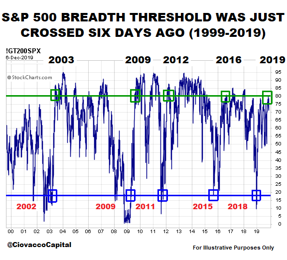
The chart below shows the percentage of S&P 500 stocks above their 200-day exponential moving average. It is rare for this breadth indicator to drop below the blue line, which is indicative of extreme pessimism about future economic and market outcomes. If you know market history, you know most signals that began to form in 2002, 2009, 2011, and 2015 turned out to be great “keep an open mind about better than expected outcomes” signals. The signal shown below is triggered when breadth gets oversold (below the blue line) and then makes it all the way back to the green line. The last round trip took place between late December 2018 and late November 2019.
ciovacco-capital-research-chris-kathy-breadth.png

HOW DID STOCKS PERFORM WALKING FORWARD?

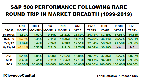
Rather than waiting for something to happen (i.e. market to make a top), the table below is based on something that just happened. In the previous cases, and based on all the data available, subsequent S&P 500 performance was very satisfying looking out three months to five years.
ciovacco-capital-research-chris-kathy-breadth2.png

Continuing with the weight of the evidence theme, ten new signals and S&P 500 performance tables are covered in the video below.

DOES THE BLOW-OFF TOP THEORY HOLD WATER?

The hot topic on Wall Street this week was “blow-off top”. How concerned should we be about an end to a euphoric stock market rally? You can decide.

REALISTIC EXPECTATIONS

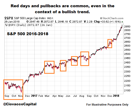
Was it a cake walk after the breadth thrust round trip that was triggered on August 23, 2016? No, reminding us that even under a longer-term bullish scenario, really scary periods are to be expected.
Red Days Are Common Normal Volatility.png

PREVIOUS SIGNALS ALIGN WITH SIGNALS ABOVE

The Seeking Alpha posts below provide additional support for the longer-term bullish case:

Financial Conditions: Today vs. 1974, 1987, 2000 And 2007

Are Financials Hinting At 2011/2016-Like Stock Market Rally?

Extremely Rare Extended Condition In Bonds: What Could It Mean For Stocks

DAY BY DAY

We will continue to test the cyclical low (December 2018) in the context of a secular trend thesis in upcoming posts and videos. If the weight of the evidence begins to shift in a bearish manner, we must be willing to adjust our assessment of the probabilities.

December 2019 Looks Nothing Like December 2018

WILL IT HAPPEN AGAIN?

Human beings tend to remember emotional events, especially painful events. December 2018 falls into the painful category, given the S&P 500 lost 14.92% between the end of November and Christmas Eve. Thus, it was unnerving for investors to see red screens in early December 2019.

THAT WAS THEN

From a “what are the odds it happens again” perspective, it might be helpful to compare December 4, 2018 to December 4, 2019. In the 2018 case, the S&P 500 closed below the 25, 39, 50, 75, 100, 125, 150, 175, and 200-day moving averages, which told us large institutions were very concerned about future market and economic outcomes.

ciovacco-short-takes-ciovacco-capital-spx-dec-2018.png

THIS IS NOW

In the 2019 case, the S&P 500 is trading above the 25, 39, 50, 75, 100, 125, 150, 175, and 200-day moving averages, which tells us large institutions are optimistic about future market and economic outcomes. If we were taking a technical analysis test and were asked is the chart below an uptrend or downtrend, we’d think that’s easy, choose uptrend, and move to the next question. In real time, it is a bit more difficult because of the news cycle and our personal biases; regardless, the answer is still easy and it is still uptrend.

ciovacco-short-takes-ciovacco-capital-spx-dec-2019.png

HOW ABOUT WEEKLY TRENDS AND MOMENTUM?

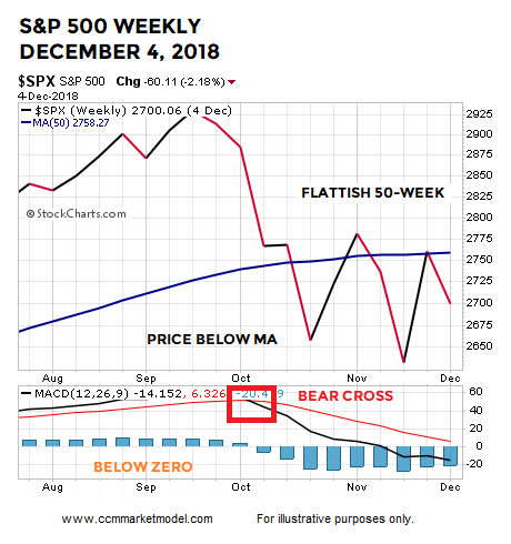
In the 2018 case, the S&P 500 was below a 50-week moving average that had a “we are concerned” look. Weekly MACD was in a “bearish cross” state and below zero, which told us the intermediate-term trend was at a higher risk of flipping to a sustained bearish trend.

short-takes-ciovacco-week-december-2018.png

WEEKLY LOOKS MUCH BETTER TODAY

The concept of a mirror image comes to mind when comparing the 2018 chart above to the 2019 chart below. In the 2019 case, the S&P 500 is above the 50-week moving average that has a “we have been getting more confident” look. Weekly MACD is currently in a “bullish cross” state. Weekly MACD is above zero, which tells us the intermediate-term trend is up and recent pullbacks have been countertrend moves.

short-takes-ciovacco-week-december-2019.png

MONTHLY TRENDS AND MOMENTUM

On December 4, 2018, the S&P 500 was below a “flattish to in jeopardy of rolling over” 10-month moving average. The market had recently experienced a bearish monthly MACD cross, telling us a bearish countertrend move was taking place.

short-takes-ciovacco-month-2018-dec.png

2019 LOOKS MUCH BETTER

Once again, the evidence we have in hand today is a polar opposite to what we had a year ago. Instead of being below the 10-month, price is above. Instead of an indecisive/rollover look, the 10-month has a bullish/turning-up look. Instead of a recent monthly MACD bearish cross, the S&P 500 recently printed a bullish monthly MACD cross.

short-takes-ciovacco-month-2019-DEC.png

ODDS TODAY vs. A YEAR AGO

It is extremely important to note, the look of all the 2018 charts shown above was BEFORE the S&P 500 lost an additional 12.64%, telling us the odds of really bad things happening was significantly higher a year ago relative to the present day.

THESE CONCEPTS WERE HELPFUL IN JANUARY 2019

Charts cannot predict the future; they simply help us assess the probability of good things happening relative to the probability of bad things happening. December 2018 was the worst December since 1931 and the plunge in Q4 was rare from a magnitude perspective. It would have been easy to remain in cash for the first few months of 2019, given the weak data on December 31, 2018 and the severity of the Q4 2018 decline. Charts like the charts shown above were helpful in terms of helping us get back in line with the market. For example, the charts below were covered in a January 11, 2019 video and presented as part of a bull/bear road map that proved to be valuable throughout 2019.

Bull Bear Guidepost Charts Jan 11 2019 small.png

The chart in the middle of the image above is dated January 10, 2019. If we looked at the same chart on April 1, 2019 (below), we can see how the evidence gradually improved between January 10, 2019 and April 1, 2019. The chart below said the odds of a sustainable uptrend were quite a bit better on April 1 relative to early January. Thus far, the uptrend has remained in place, meaning the April 1 chart was helpful.

ciovacco-short-takes-ciovacco-capital-spx-april-1-2019n.png

Is it possible all the 2019 charts shown above begin to morph into more concerning looks similar to the concerning looks on December 4, 2018? Yes, it may happen and it may happen soon, but it has not happened yet.

OTHER FORMS OF HELPFUL EVIDENCE IN 2019

While it is never easy navigating near a major low (December 2018), the market has provided numerous “this does not look like a bear market” and “this does not look like a recession is underway” clues since January 11, 2019.

This Never Happened In The 1974, 2001, And 2008 Bear Markets

Rare Bullish Shift In P&F Buy Signals

Learning From The 1998, 2002, 2009, 2011, And 2016 Stock Market Lows

An Extremely Rare Move In Bonds, How Have Stocks And Bonds Performed In The Past?

What Typically Happens When These Charts Flip?

Are Institutions Selling Into This Rally?

Monthly Breadth:  Dark Clouds Or A Ray Of Hope?

History Says Stocks Could Rocket Higher Over The Next Two Years

Do The Facts Support Gloom And Doom Or Higher Highs In Stocks?

2019 Market Action Points To Positive Long-Term Outcomes

The Bullish Message From The Stock/Bond Ratio

Are National Financial Conditions Saying The Stock Market Is In Big Trouble?

Bulls Trying To Make A Stand

History Says Stocks Can Perform Very Well After Big Oil Shocks

Bulls Have Setups In Place For Monster Breakout

The Road Ahead May Be Brighter Than Expectations

Trade, Impeachment, And The Conviction Of Buyers And Sellers

Similar Drops In ISM Manufacturing Data

The Six Most Powerful Charts On Wall Street

Demographic Sweet Spot Says Bull Market Could Last Until 2035

Bulls Still Have Support For Upside Breakout

History Says Stocks Could Still Soar To Unimaginable Heights

VOLATILITY IS A NORMAL PART OF ALL TRENDS

As outlined in the posts above dated between January 21 and November 4, the market and economy have provided numerous reasons to keep an open mind about better than expected outcomes. Now that stocks are near an all-time high, it can be easy to forget all the volatility that took place between those two dates. The moral of the story is even IF really good things happen in the weeks, months, and years ahead, we can expect a ton of volatility and scary headlines along the way. We will continue to take it day by day with an open mind about all outcomes, from wildly bullish to wildly bearish.

Rare Equity Fund Outflows

STOCK PERFORMANCE FOLLOWING SIMILAR MOVES

Retail investors have erred on the side of caution in 2019. From a recent MarketWatch article:

Analysts said the “extremely cautious stance” of retail investors this year had been puzzling and acted as a drag for equity markets… Years of high bond inflows, such as 2012 and 2017 — and now 2019 — have typically been followed by weak bond fund inflows the following year.

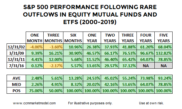
Not only have bond inflows been strong, but outflows from equity mutual funds and ETFs have come at a six-month pace similar to December 2002, March 2009, December 2011, and July 2016. The BNP Paribas chart below was posted on Mark Ungewitter’s Twitter feed.

ciovacco-equity-fund-outflows.png

Given unusually high rates of equity outflows align conceptually with unusually high rates of pessimism, it would not be surprising if stocks performed well walking forward from the four periods highlighted in the BNP Paribas graph above. The table below shows S&P 500 performance was quite attractive in all four cases.

ciovacco-short-takes-chris-outflows-table2.png

The yellow portions of the table above help keep us grounded relative to how markets operate in the real world.

TODAY vs. SIGNIFICANT MARKET TOPS

It might be helpful to compare present-day equity fund flows to fund flows seen prior to the major stock market peaks in 2000 and 2007. As shown in the chart below, 2019 looks significantly different from March 2000 and October 2007.

ciovacco-equity-fund-outflows2.png

REALISTIC EXPECTATIONS

After showing weak ISM Manufacturing Survey data was not necessarily a showstopper on October 1, the S&P 500 found its footing and made an intraday low of 2855 on October 3; from that low, the S&P 500 rallied 299 points, hitting the recent intraday high of 3154 on November 27. Some giveback or retracement after a 299 point move would not fall into the shocking category. Our focus is on longer timeframes.

ciovacco-short-takes-blog-2019-spxy.png

VOLATILITY IS NORMAL, RATHER THAN ABNORMAL

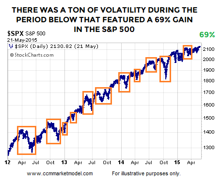
In the historical cases shown above, was it a cake walk after fund flows reversed? No, walking forward from the end of December 2011, stocks rallied for over three years, but that move had plenty of normal-and-to-be-expected volatility between point A and point B. It is easy to look at the chart below and say, “Yes, we all know markets have red days and corrections during an uptrend”. It is a little bit harder to respect normal volatility when the market is open and your screen is covered in red.

ciovacco-short-takes-blog-2019-spxy4.png

WEIGHT OF THE EVIDENCE

The fund flows analysis above aligns with a recent study of stands near the 200-week, relatively high cash balances, and recycled DeMark counts.

WEEKLY VIDEO

The Thanksgiving week video opens with the possible significance of the monthly MACD cross that was nailed down after the Dow’s close on Friday, November 29.

DAY BY DAY

All of the above speak to probabilities, which is significantly different from certainty. We will continue to take it day by day with an open mind about a wide range of outcomes, from wildly bullish to wildly bearish.