
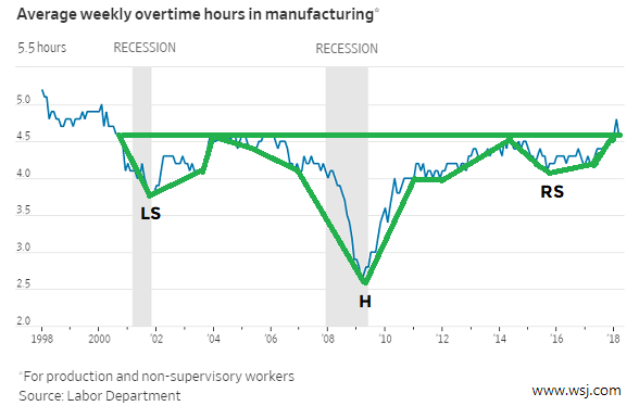
LONG-TERM BREAKOUT IN OVERTIME HOURS
The chart below appeared in the April 13 edition of The Wall Street Journal; it shows average weekly overtime hours in manufacturing recently broke above a level that had acted as resistance for a number of years. Notice the lows take place in 2001, 2009, and 2015 (LS, H, and RS). Employers who are experiencing strong demand for their products and services are willing to pay for overtime. Conversely, when employers are concerned about their business they tend to discourage overtime.
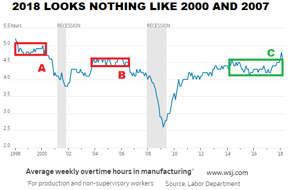
2018 DOES NOT HAVE A PRE-RECESSION LOOK
Compare and contrast the pre-recession looks in the chart below (points A and B) to the recent breakout near point C. Average weekly overtime hours in manufacturing started declining well before the last two recessions (shaded areas).
MISCONCEPTIONS CAN LEAD TO DISAPPOINTING RESULTS
This week's video takes a detailed look at how markets operate in the real world, allowing us to examine both realistic and unrealistic investment expectations and objectives.
SHORT-TERM vs. LONG-TERM
There are numerous charts that align with the "keep an open mind about better than expected outcomes" overtime chart described above, including the long-term chart featured on January 16.
Short term, the stock market still has some "prove it to me" work to do. The longer the S&P 500 can stay above the lower end of its current trading range (2532) and the further price can move above the yellow box (2675), the better the odds for a resumption of the primary trend. A sustained drop below 2532 would significantly improve the bearish case.

Time will tell. We will continue to take it day by day.