
KEEPING OUR EYE ON THE BALL
As human beings, we all tend to focus on what is in front of us. During the session on Tuesday, June 19, this is what was in front of us.

GETTING A MORE BALANCED VIEW IN FRONT OF US
One of the keys to making more prudent and rational decisions is to look at more than just the red screen in front of us, which represents only one timeframe (the shortest). It can also be helpful to think in extremes. Let's assume the gloom-and-doomers are correct in their never-ending assertion that:
- Stocks are wildly overvalued.
- We are in one of the biggest bubbles in history.
- The S&P 500 is in the process of forming a major top.
- A trade war and the end of QE will take down risk assets.
- A decline in stocks on the order of 50% is just around the corner.
- The market leader, tech, is extremely vulnerable.
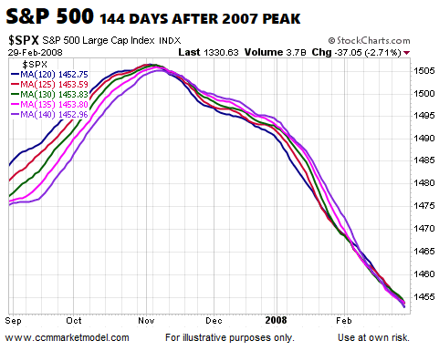
If the S&P 500's peak on January 26, 2018 (144 days ago) was the beginning of the end for the bull market, a 50% decline is coming, and the long-term uptrend in tech is ending, we would expect many market participants to be seeking shelter in safe-haven assets, such as gold, which is exactly what happened after the peak in 2007. Notice in the chart below how the conviction to own growth-oriented tech stocks had weakened considerably relative to the conviction to own armageddon-friendly gold 144 days after the market peaked in October 2007. The trend clearly flipped toward bearish outcomes in late November 2007; after that really bad things happened in the stock market.

In the 2007 case above, the S&P 500 dropped over 50% and the tech-heavy NASDAQ dropped over 55%, which aligns nicely with the gloom-and-doom forecast for 2018. Therefore, since the chart above shows bullish conviction relative to armageddon conviction 144 days after the market peaked in 2007, if the odds in 2018 favored bearish outcomes, we would expect to see a similar and gloomy turn 144 days after the market peak in 2018, which is not the case (see below). The present-day chart still has a full-bore bullish look, which is in sharp contrast to the full-bore bearish look 144 days after the peak in 2007.
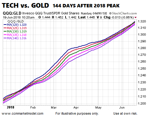
In 2007, 144 days after the peak, the bears were clearly in control. In 2018, 144 days after the peak, the long-term trend clearly favors the tech bulls (QQQ) relative to the armageddon bears (GLD). The quote below sheds some additional light on the charts above.
“Everyone is entitled to his own opinion, but not to his own facts.”
THE BROAD MARKET LOOKS NOTHING LIKE 2007-08
The subheading above may sound like a bold statement. However, the statement is clearly supported by the facts. The S&P 500 peaked on October 9, 2007. The chart below shows the same moving averages 144 days after the peak; the bears were clearly in control.
In 2018, the S&P 500 peaked on January 26. June 19 is 144 days after the 2018 peak in the stock market. If the market was rolling over and heading for a 50% drop, we would expect the chart below to be taking on similar characteristics observable in the chart above, which is not the case. In the upper right hand corner of the chart below, we can see the 25 point drop in the S&P 500 that was taking place intraday on June 19. With some additional and longer-term context, the 25 point drop does not seem nearly as concerning.

MORE FACTS TO EXAMINE
The broader the evidence, the more convincing the case. This week's video hosts the World Cup of Markets. The first round consists of 16 risk-on vs. risk-off matches, allowing us to get a better read on the weight of the evidence.
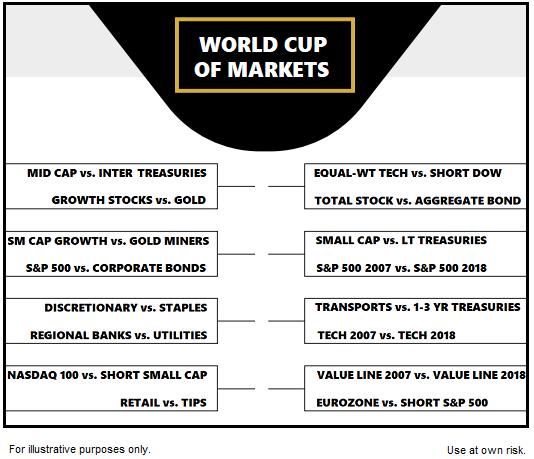
This week's video walks through all 16 matches, giving us a better understanding of how concerned market participants are about a trade war and the end of QE.
STUDY AFTER STUDY SHOWS
If you have invested for any length of time, you have run across numerous studies that show the more often you check the markets and your account balance, the lower your returns. For example, in the study The Effect of Myopia and Loss Aversion on Risk Taking, Thaler, Tversky, and Kahneman concluded:
“The investors who got the most frequent feedback (and thus the most information) took the least risk and earned the least money.”
REMAINING COOL, CALM, AND COLLECTED
The concepts outlined on February 6 sill apply
While they seem unprecedented and/or unnerving while they are occurring, market dislocations are not all that rare. Experience says those that remain cool, calm, and collected with their eye on data from multiple timeframes have the greatest chance of being satisfied with their results looking back six months from now.
Since the close on February 5, the NASDAQ gained 10.27%. Thus far, remaining patient with an eye on the weight of the evidence, including the longer-term trends, has produced satisfying results. We will continue to take it day by day remaining open to all outcomes from wildly bullish to wildly bearish.