S&P 500 Retracements

CORRECTION OR BEAR MARKET?

The answer to the question is this a normal correction or the start of something much worse will only be revealed over time.  However, there are numerous ways to gain a better understanding of the probabilities, including Fibonacci retracements.

It is relatively common for an existing bullish trend to retrace or give back 38.2%, 50%, or 61.8% of a prior A to B bullish move.  The S&P 500 had a multiple-week pullback that began in early March 2017.  The market found its footing near point A in the chart below and rallied until late January 2018 (point B).  The S&P 500 found support from buyers near the 61.8% retracement on February 9, 2018.  Since then, price has consolidated above the 61.8% retracement level. 

short-takes-normal-pullback-22a.png

MORAL OF THE STORY

Even if we only look back as far as March 2017, the current pullback looks like a normal retracement within the context of an established and ongoing long-term bullish trend.  If the bullish trend remains intact (TBD),  it is logical to expect the S&P 500 will eventually make a higher high above the January 2018 peak (point B).  Time will tell.

THE PSYCHOLOGY BEHIND 'THIS WILL END BADLY'

The dot-com bust (2000-2002) and the financial crisis (2007-2009) caused an incredible amount of stress in many American households; a fact that is still impacting investor psychology in today's markets.  If you were 7 years old in 1997, you were 23 when the S&P 500 was nearing the 2000 and 2007 highs in 2013.  If you were 55 in 1997, you were 71 in 2013 (see chart below).

short-takes-this-will-end-badly.png

Based on the 2013 chart and demographics shown above, it is easy to understand why it was common to hear "this will end badly".  Anyone between the ages of 23 and 71 in 2013 had two "this ended badly" memories fresh in their minds. 

2018:  28 TO 76 YEAR OLDS HAVE PAINFUL MEMORIES

If we fast forward to 2018, the table below shows the vast majority of 2018 market participants were between the ages of 7 and 55 in 1997.  They experienced both the dot-com and financial crisis bear markets.  Thus, the vast majority of market participants in 2018 still have an emotional connection to "bull markets end in a painful manner".

short-takes-age-table.png

WHAT HAPPENS IF WE LOOK FURTHER BACK IN HISTORY?

We all know stock market history is not confined to the 1997-2018 period.  Is it possible our perceptions of the present day market would change if we reviewed today's market in a much longer (1926-2018) context?  You can decide after watching this week's video.

MYTH BUSTER: RISING OIL PRICES WILL KILL STOCKS AND THE ECONOMY

THE SAME NARRATIVE OVER AND OVER AGAIN

Jesse Livermore's "there is nothing new on Wall Street" applies to the never-ending commentary about the impact of oil prices on the economy, earnings, and the stock market. 

We are currently in a "rising oil prices will kill the economy and stock market" period.  Therefore, it is prudent to ask:

"Is it possible for stocks and the economy to perform well during a period of rising oil prices?"

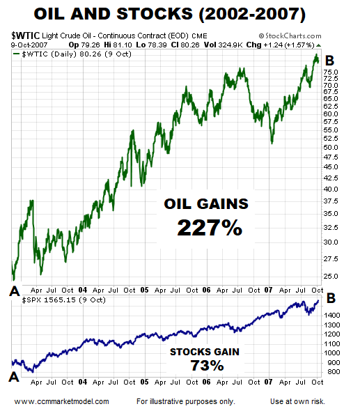
The chart below shows the price of crude oil and the S&P 500 between November 2002 and October 2007.  As you can see, stocks gained 73% during a period that featured a 227% rise in the price of oil.  

SMPO I 889.png

STOP WASTING ENERGY ON STOCKS AND THE PRICE OF OIL

It was not long ago that we were in a "falling oil prices will kill earnings and the stock market" period.  The table below shows calendar years that contained a significant peak to trough decline in the price of oil.  As you can see, stocks can perform just fine in years that feature a significant decline in the price of oil. 

Oil Plummets Ciovacco Capital Research.png

MORAL OF THE STORY

The correlation between oil prices and stocks is all over the place:

  • Sometimes oil rises and stocks rise
  • Sometimes oil rises and stocks fall
  • Sometimes oil falls and stocks fall
  • Sometimes oil falls and stocks rise

If you are trading or investing in oil, then it is prudent to track the price of oil.  If you are trading or investing in the stock market, following the price of oil will do nothing but confuse you.   There is no consistent or meaningful correlation between the direction of oil prices and the direction of the stock market. 


THIS SIGNAL CAN FORESHADOW A SIGNIFICANT PRICE MOVE

CHARTS SPEAK FOR THEMSELVES

The S&P 500 peaked 101 days ago on January 26, 2018.  Williams %R, which helps us track momentum, is shown at the bottom of each weekly chart below.  The red arrow shows S&P 500 momentum reached "oversold" territory in March.  During the subsequent drops (blue arrows), the bears were unable to push momentum back into oversold territory, which tells us to be open to better than expected outcomes in the weeks and months ahead.

short-takes-may-7-2018-a.png

THE NASDAQ LOOKS EVEN BETTER

Bullish momentum was so strong before the January 2018 peak that even after correcting/consolidating for 101 days, the NASDAQ has remained above oversold territory, which is a sign of strength.

short-takes-may-7-2018-b.png

2011 CORRECTION:  NASDAQ

Compare and contrast the 2018 chart (above) to the 2011 chart (below).  Notice how momentum was much weaker in 2011.

short-takes-may-7-2018-c2.png

TECH STOCKS IN 2018

Like the NASDAQ, momentum in the technology sector (XLK) has remained incredibly strong since markets peaked in January.

short-takes-may-7-2018-e.png

TECH STOCKS IN 2007

Compare and contrast the 2018 chart (above) to the 2007 chart (below).  Notice how momentum in the technology sector was much weaker in late 2007/early 2008.

short-takes-may-7-2018-f.png

S&P 500'S LONG-TERM OUTLOOK

In November 2016 bullish setups on the chart of the S&P 500 turned out to be helpful.  This week's video revisits that analysis to see if the long-term bullish conclusions have been negated during the recent stock market correction. 


MOMENTUM FAILURE IN 1998

When the bears had control of the short-term trends in 1998, they were unable to push bearish momentum back into oversold territory in late September/early October; this is known as a momentum failure (see blue arrow below).  The momentum failure said "be open to better than expected outcomes in the weeks and months ahead".

short-takes-may-7-2018-g.png

According to StockCharts.com:

"The failure to move back into overbought or oversold territory signals a change in momentum that can foreshadow a significant price move."

WHAT HAPPENED AFTER THE MOMENTUM FAILURE?

After the bears failed to push momentum back into oversold territory in 1998 (blue arrow bottom of image), the NASDAQ found its footing and tacked on 240%.  The box in the upper left hand corned of the image shows a similar situation on the present day weekly chart of the S&P 500, telling us to keep an open mind about better than expected outcomes in the weeks and months ahead. 

short-takes-may-7-2018-h.png