
The Long-Term Message From The VIX
STOCKS vs. EXPECTED VOLATILITY
The VIX measures the market’s expectation of future volatility. We can think of the S&P 500/VIX ratio as a way to track confidence in stocks and earnings relative to confidence the market will be volatile. The S&P 500/VIX ratio is currently in the process of trying to complete a relatively rare longer-term shift.
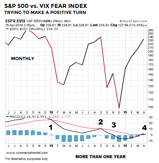
Number One: Bearish MACD cross above the centerline tells us the intermediate-term trend shifted to favoring volatility over stocks.
Number Two: The intermediate-trend trend failed to flip back in favor of stocks (MACD black stayed below MACD red).
Number Three: MACD black dropped below the centerline which indicated the longer-term trend was starting to favor volatility over stocks.
Number Four: In April 2019, MACD is trying to complete two steps: (1) MACD black above MACD red tells us the intermediate-term trend is trying to flip back in favor of stocks, and (2) MACD black above the centerline tells us the long-term trend is trying to turn back in favor of stocks.
Important: It took over 365 calendar days to complete all four steps, telling us this was a long-term shift in sentiment and economic confidence that produced heavy selling pressure before seeing a reversal in 2019.
WHAT DOES HISTORY TELL US?
The VIX is a relatively new instrument; thus, our study period only dates back to 1993. How many times has the S&P 500/VIX ratio been able to check all four boxes over a 365-day period or longer? The answer is four times. The 1996-1997 case is shown below.

WHAT HAPPENED NEXT?
The table below shows S&P 500 performance after all the boxes had been checked in each historical case. Returns had a positive bias over the first 90 days, but the 1997 case reminds us givebacks, corrections, and retracements are a normal part of all trends. Given our longer-term approach, the more relevant outcome in the historical cases was the market’s longer-term performance. All four historical cases posted positive returns 2.5 years down the road with the average and median gain exceeding 30%.

THE MOTHER OF ALL BREADTH-BASED SIGNALS?
This week’s stock market video looks at a rare move that took place between 12/24/2018 and 04/08/2019 and asks how many times has this taken place in the past and what happened next in the stock market?
WEIGHT OF THE EVIDENCE
There is nothing magical about the S&P 500/VIX ratio. However, it is another example of something that just happened in the present day that was followed by favorable long-term results in the stock market, telling us to keep an open mind about the possibility of better than expected outcomes in the coming months and years.
Given it is only April 15, the look of the 2019 S&P 500/VIX chart must carry into month-end; something that falls into the TBD category.
The Mother of All Breadth Thrust Signals?
DOES SIGNAL ALIGN WITH OR CONTRADICT MARKET’S RECENT ADVANCE?
Are Financials Hinting At 2011/2016-Like Stock Market Rally?
TRYING TO MAKE A RELATIVE TURN
The chart below shows the performance of financial stocks (XLF) relative to the S&P 500 (SPY). Since making a low in late 2011 (point A), the XLF:SPY ratio has been trading in the slightly upward-sloping blue trend channel. Anecdotally, it is interesting to note point A came on November 30, 2011 and point B on July 31, 2016; both attractive entry points for the general stock market.

The tables below show S&P 500 and NASDAQ performance following point A and point B, telling us to keep an open mind about better than expected outcomes in the stock market over the next two years. The first 30-90 days reflect normal market volatility, meaning even if good things happen over the next two years, we should expect pullbacks, red days, red weeks, and red months.

Given the wide fluctuations in the correlation between XLF:SPY and SPY, the XLF:SPY channel above falls into the “that’s interesting” category. However, the concept of shifting bullish momentum, similar to the turns in 2011 and 2016, aligns with a broad array of evidence in 2019. For example, numerous growth-oriented ETFs made 2016-like turns in Q1 2019, as noted in the tweet below dated February 4.

WHAT ABOUT RED DAYS?
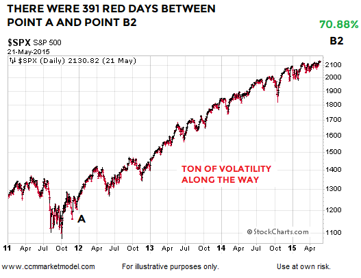
Point A in the XLF:SPY graph is November 30, 2011. The S&P 500 gained over 70% between point A and point B2 (graph below). To capture that gain, an investor had to endure 391 red trading sessions with an average decline of 0.56%. There were 481 green trading days with an average gain of 0.57%. Therefore, we learn very little about the market’s long-term health by reviewing a red day or cluster of red days in isolation. Red days are normal and to be expected.
OTHER FORMS OF EVIDENCE
This video clip covers numerous forms of “be open to better than expected outcomes” evidence that has accrued in 2019. When new data comes to light, evidence can shift. Thus, nothing says the XLF:SPY ratio can’t experience a bearish breakdown and negate the pattern that has been in place since 2011. For now, the longer-term evidence we have in hand remains constructive. We will continue to take it day by day, while remaining open to all outcomes, from wildly bullish to wildly bearish.