Recycled DeMark Counts And S&P 500 Performance

BULLISH SIGNAL APPEARED THIS WEEK

While there are some legitimate short-term concerns related to sentiment and market breadth, we also must consider the potential bullish implications of a series of extremely rare DeMark signals that have appeared on the daily chart of the S&P 500.

DeMark counts are proprietary tools from Market Studies, LLC that help identify possible trend exhaustion via a 9-13 count. In very rare instances, when trends and momentum are strong, DeMark counts are recycled. A recycled count is denoted by the blue R shown in the image below.

Recycled Count DeMark.png

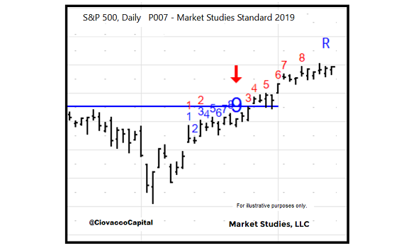
As of Thursday’s close the daily DeMark Combo count is being recycled. If the recycled state remains in place, it would be helpful to know:

  • How many times has the S&P 500’s daily DeMark Combo count been recycled since 1982?

  • How did the stock market perform following the recycled counts?

Given a recycled count occurs in instances marked by strong trends and momentum, we would expect a recycled count to lean bullish from an odds perspective. There have been five previous periods that featured the same signal that is currently appearing on the daily chart of the S&P 500; in every case, stocks were higher looking out one month to five years.

demark-counts-ciovacco-capital-table.png

DeMark has four major exhaustion counts, including the Combo count covered above. The other three major DeMark exhaustion counts were recycled in recent sessions as well.

RECYCLED COUNT IS PART OF THE WEIGHT OF THE EVIDENCE

The recycled count, like any other bullish or bearish form of evidence, speaks to odds. This week’s CCM weekly stock market video, due to be released Friday evening November 15, will cover other forms of evidence, including detailed comparisons to bearish periods in 1929, 1974, 1987, 2000, and 2007. This week’s video will contain many important charts to help us fairly assess both sides of the bull/bear coin.

The Long-Term Message From Transportation Stocks

SIMILARITIES TO 2011-2012 AND 2015-2016

Over the past ten months, numerous developments (breadth thrusts, asset class behavior, sentiment, etc.) have told us to remain open to a bottoming-process/rally similar to action following major stock market lows in October 2011 and February 2016. After experiencing resistance at the blue line in the graph below, the Dow Jones Transportation Average finally broke out in December 2012, which provided another indication of increasing risk appetite. Following the “this looks different move” in transportation stocks, the S&P 500 tacked on an additional 50% over the next 2.4 years.

Dow Jones Transportation Average Breakout 2012.png

SIMILAR BREAKOUT IN 2016

The “increasing risk appetite” pattern was also in play after stocks made a major low in February 2016. The Dow Jones Transportation Average experienced resistance at the blue line below for several months before breaking out in November 2016. After the push higher in transportation stocks, the S&P 500 gained an additional 34.27% over the next 1.2 years.

Dow Jones Transportation Average Breakout 2016.png

SIMILAR PATTERN IN HUMAN BEHAVIOR 2018-2019

The Dow Jones Transportation Average had trouble clearing the blue line below in September 2018, April 2019, July 2019, and again in September 2019. Transportation stocks have successfully cleared the formally insurmountable line in recent sessions. The longer the breakout remains in place, the more meaningful it becomes.

Dow Jones Transportation Average Breakout 2019.png

HOW DID STOCKS AND BONDS PERFORM IN 2012 AND 2016?

Logic says it leans bullish when economically-sensitive transportation stocks are able to clear previous areas of multi-month resistance. Thus, we would expect growth-oriented stocks to outperform defensive-oriented bonds following breakouts similar to the ones shown above that took place in December 2012 and November 2016. Not surprisingly, that is exactly what happened in the two previous cases.

ciovacco-chris-kathy-stocks-transportation-breakout.png

THESE CHARTS SAY THE STOCK MARKET’S POTENTIAL UPSIDE IS MUCH GREATER THAN MOST BELIEVE

This week’s CCM stock market video provides a very long-term view rarely covered on Wall Street. Since markets exhibit fractal behavior, everything we know on a daily chart also applies to every conceivable timeframe from one-minute charts to annual charts. You can draw your own conclusions after reviewing common patterns in human behavior over the past sixty-six years.

RECENT BREAKOUT ALIGNS WITH PREVIOUS SIGNALS

Numerous forms of observable evidence have been in place over the past ten months that align with the “stocks could significantly outperform bonds” message above, including data covered in the posts below:

After An Extremely Rare Move In Bonds, How Have Stocks And Bonds Performed In The Past?

The Bullish Message From The Stock/Bond Ratio

Demographic Sweet Spot Says Bull Market Could Last Until 2035

Signs Of Risk Appetite

BABY STEPS AWAY FROM FEAR

Despite very little hard evidence a recession was imminent, market participants have been highly risk-averse in recent months. While many of the charts below still have hurdles to clear, some incremental steps were recently taken away from the Armageddon narrative. Banks are trying to break out from a range that has been in place since February. KBE printed a new multi-month high Monday.

ciovacco-capital-short-takes-spx33.png

The Dow Jones Transportation Average still has some work to do, but it has taken some incremental steps and recently printed a multi-month high.

ciovacco-capital-short-takes-spx23.png

Tech stocks relative to consumer staples cleared a trendline that acted as resistance in April, July, and October.

ciovacco-capital-short-takes-spx28.png

Financial stocks also made some “risk-on” progress relative to more defensive-oriented bonds.

ciovacco-capital-short-takes-spx32.png

A similar “maybe the world is going to stay on its axis” look can be found on the chart showing the performance of the S&P 500 relative to bonds.

ciovacco-capital-short-takes-spx22.png

The trade war contributed to increasing conviction to own lower-volatility sectors. With trade rhetoric having moved into the “toned down” camp in recent weeks, the broader market has made some relative progress.

ciovacco-capital-short-takes-spx26.png

Monday’s session also featured the S&P 500/corporate bond ratio clearing a trendline that had rejected risk seekers in May, July, and October.

ciovacco-capital-short-takes-spx25.png

RARE LONG-TERM BULLISH SIGNALS AROUND THE GLOBE

Do longer-term setups tell us there is a realistic possibility of stocks continuing to march higher over the next one to five years? You can decide after reviewing the facts in this week’s video.

INTERMEDIATE AND LONG-TERM LOOKS

Treasury bonds turned down relative to the S&P 500 at important turning points for stocks in 2012, 2016, and 2018; the S&P 500 is shown at the bottom of the chart below as a “risk-on” reference point. The current look of the chart says good things could still happen for stocks relative to bonds.

ciovacco-capital-short-takes-spx24.png

The same concepts apply from a much longer-term perspective when viewing the stock/bond ratio below. The ratio is trying to make a stand near an area that could act as major support and as a potential launching point for stocks relative to bonds.

ciovacco-capital-short-takes-spx30.png

THE MARKET HAS BEEN PROVIDING FACTUAL CLUES SINCE MID-JANUARY

The “be open to bullish outcomes” message is not particularly new. In fact, the blurb below comes from a Short Takes posted dated January 21, 2019:

In last week’s CCM stock market video, we noted the slope of the S&P 500’s 200-day moving average told us to keep an open mind about better than expected outcomes in the days, weeks, and months ahead. A recent development on the breadth front also falls into that bullish-open-mind category.

While it is never easy navigating near a major low (December 2018), the market has provided numerous “this does not look like a bear market” and “this does not look like a recession is underway” clues since the rare breadth thrust that was covered on January 21:

This Never Happened In The 1974, 2001, And 2008 Bear Markets

Rare Bullish Shift In P&F Buy Signals

Learning From The 1998, 2002, 2009, 2011, And 2016 Stock Market Lows

An Extremely Rare Move In Bonds, How Have Stocks And Bonds Performed In The Past?

What Typically Happens When These Charts Flip?

Are Institutions Selling Into This Rally?

Monthly Breadth:  Dark Clouds Or A Ray Of Hope?

History Says Stocks Could Rocket Higher Over The Next Two Years

Do The Facts Support Gloom And Doom Or Higher Highs In Stocks?

2019 Market Action Points To Positive Long-Term Outcomes

The Bullish Message From The Stock/Bond Ratio

Are National Financial Conditions Saying The Stock Market Is In Big Trouble?

Bulls Trying To Make A Stand

History Says Stocks Can Perform Very Well After Big Oil Shocks

Bulls Have Setups In Place For Monster Breakout

The Road Ahead May Be Brighter Than Expectations

Trade, Impeachment, And The Conviction Of Buyers And Sellers

Similar Drops In ISM Manufacturing Data

The Six Most Powerful Charts On Wall Street

Demographic Sweet Spot Says Bull Market Could Last Until 2035

Bulls Still Have Support For Upside Breakout

History Says Stocks Could Still Soar To Unimaginable Heights

VOLATILITY IS A NORMAL PART OF ALL TRENDS

As outlined in the posts above dated between January 21 and November 4, the market and economy have provided numerous reasons to keep an open mind about better than expected outcomes. Now that stocks are near an all-time high, it can be easy to forget all the volatility that took place between those two dates. The moral of the story is even IF really good things happen in the weeks, months, and years ahead, we can expect a ton of volatility and scary headlines along the way. We will continue to take it day by day with an open mind about all outcomes, from wildly bullish to wildly bearish.