Today Looks Nothing Like A Blow-Off Stock Market Top

1929: THIS IS WHAT A MELT-UP LOOKS LIKE

Prior to the major stock market peak on September 3, 1929, the Dow Jones Industrial Average gained 97% over the previous 661 calendar days.

ciovacco-capital-market-model.png

1987: IRRATIONAL EXUBERANCE LOOK

When the stock market peaked in 1987, it was extended in a big way. The gain over the previous 661 calendar days was 76%.

ciovacco-capital-market-model-1987.png

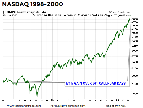
2000: THIS IS WHAT A BLOW-OFF TOP LOOKS LIKE

Blow-off tops are rare, but they do occur from time to time. One of the best examples in history is the final leg up in the NASDAQ before the bubble popped in 2000. It is an understatement to say the market was extended and vulnerable on March 10, 2000. Looking back 661 calendar days from the peak, the NASDAQ had tacked on an unbelievable 174%.

ciovacco-capital-market-model- nasdaq-blow-off-top.png

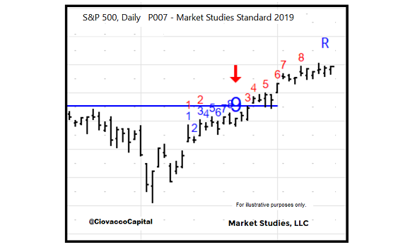
THIS IS WHAT NOVEMBER 2019 LOOKS LIKE

Instead of posting eye-popping gains, like 97%, 76%, or 174%, if we look back over the last 661 calendar days, the S&P 500 has gained a modest 8.5%. Risk speaks to being extended from a base (see three cases above). In 2019, we are just now trying to break out from a long-term base. Relative to history, the terms “melt-up” and “blow-off” do not apply to the facts we have in hand today.

ciovacco-capital-market-model-2019-11.png

2019 LOOKS LIKE THE EARLY STAGES OF A NEW TREND

This week’s stock market video covers a wide range of bullish and bearish periods from history to test the cyclical-low hypothesis that was formed in January 2019. You can draw you own conclusions after seeing comparisons to 1929, 1974, 1987, 2000, and 2007.

DAY BY DAY ACCORDING TO THE DATA

The charts above help us with the same “keep an open mind about all outcomes” concepts that were captured in the blurb below from a February 20, 2019 Seeking Alpha post:

“Having something concrete and measurable that differentiates 2018-2019 from three of the greatest percentage-decline bear markets in history (73-74, 00-02, 07-09) speaks favorably to bull/bear probabilities in February 2019.”

The data we have in hand today tells us the market’s upside potential is much greater than many can wrap their minds around. If the data deteriorates in a meaningful way, we must be flexible enough to reassess the odds of good things happening relative to the odds of bad things happening.

Recycled DeMark Counts And S&P 500 Performance

BULLISH SIGNAL APPEARED THIS WEEK

While there are some legitimate short-term concerns related to sentiment and market breadth, we also must consider the potential bullish implications of a series of extremely rare DeMark signals that have appeared on the daily chart of the S&P 500.

DeMark counts are proprietary tools from Market Studies, LLC that help identify possible trend exhaustion via a 9-13 count. In very rare instances, when trends and momentum are strong, DeMark counts are recycled. A recycled count is denoted by the blue R shown in the image below.

Recycled Count DeMark.png

As of Thursday’s close the daily DeMark Combo count is being recycled. If the recycled state remains in place, it would be helpful to know:

  • How many times has the S&P 500’s daily DeMark Combo count been recycled since 1982?

  • How did the stock market perform following the recycled counts?

Given a recycled count occurs in instances marked by strong trends and momentum, we would expect a recycled count to lean bullish from an odds perspective. There have been five previous periods that featured the same signal that is currently appearing on the daily chart of the S&P 500; in every case, stocks were higher looking out one month to five years.

demark-counts-ciovacco-capital-table.png

DeMark has four major exhaustion counts, including the Combo count covered above. The other three major DeMark exhaustion counts were recycled in recent sessions as well.

RECYCLED COUNT IS PART OF THE WEIGHT OF THE EVIDENCE

The recycled count, like any other bullish or bearish form of evidence, speaks to odds. This week’s CCM weekly stock market video, due to be released Friday evening November 15, will cover other forms of evidence, including detailed comparisons to bearish periods in 1929, 1974, 1987, 2000, and 2007. This week’s video will contain many important charts to help us fairly assess both sides of the bull/bear coin.